

Glass Splashbacks Photo Gallery
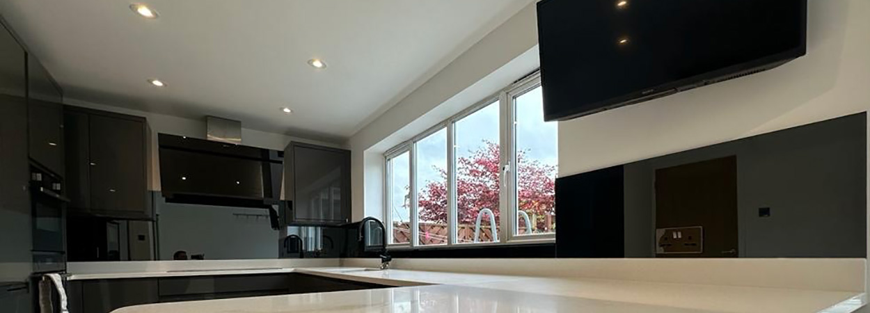
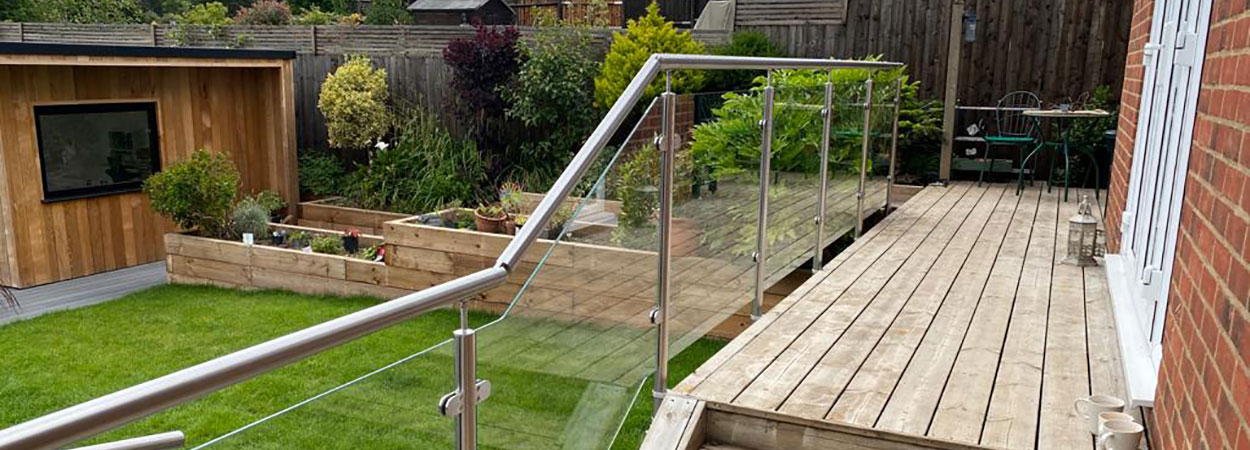
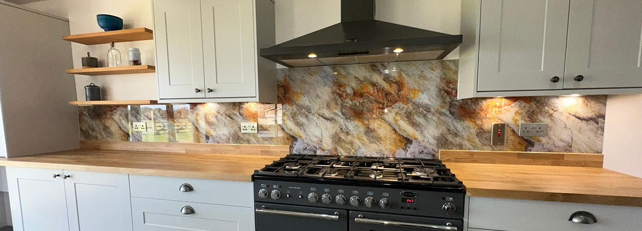
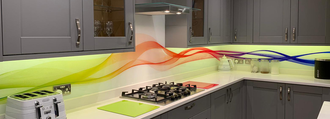
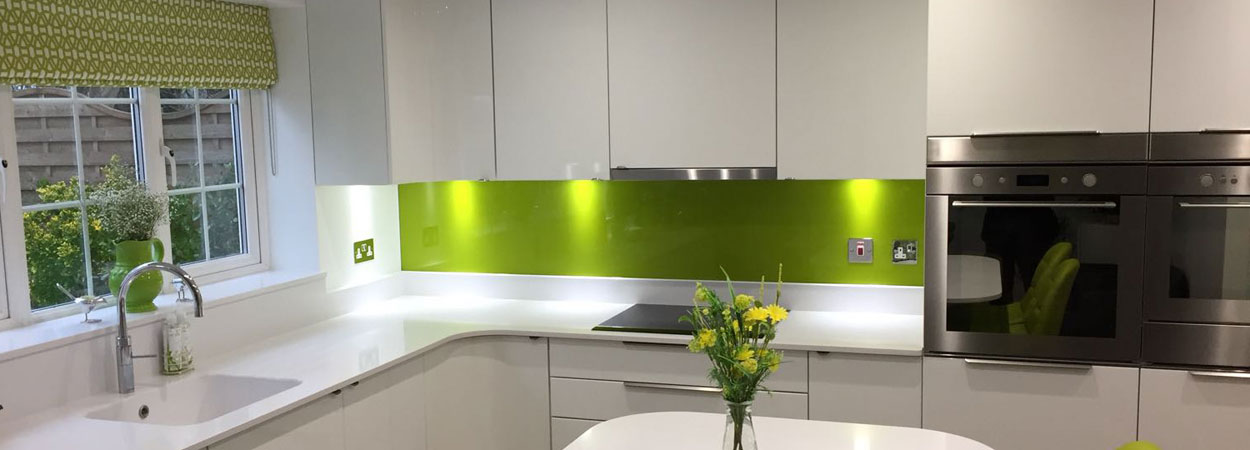
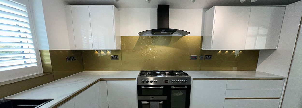
Here is a selection of completed work from Splashbacks of Distinction.
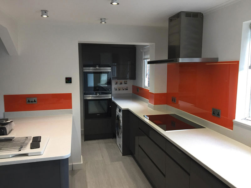
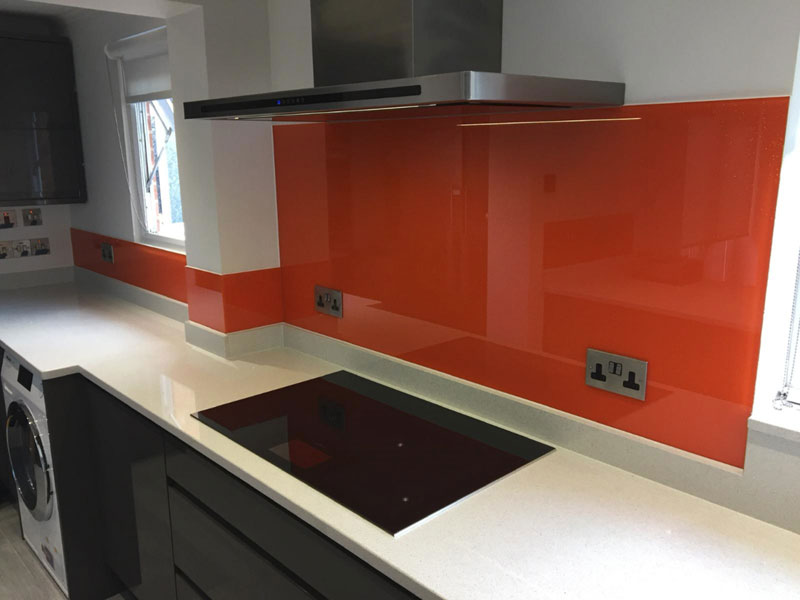
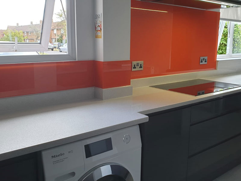
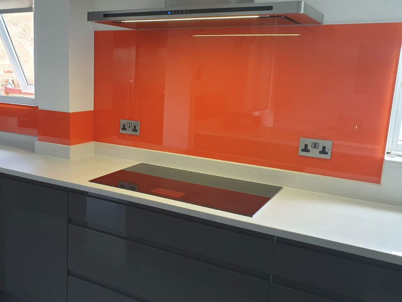
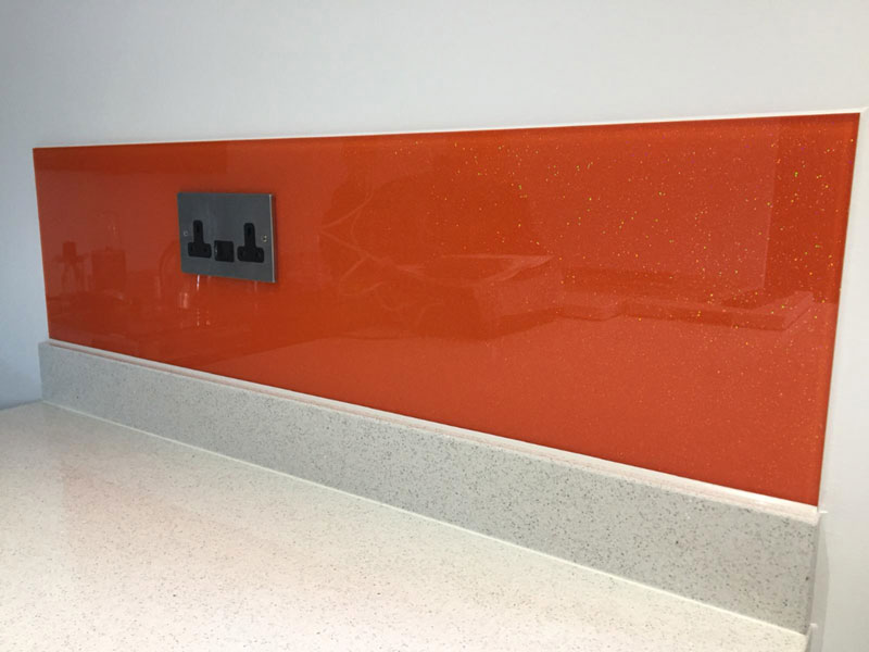
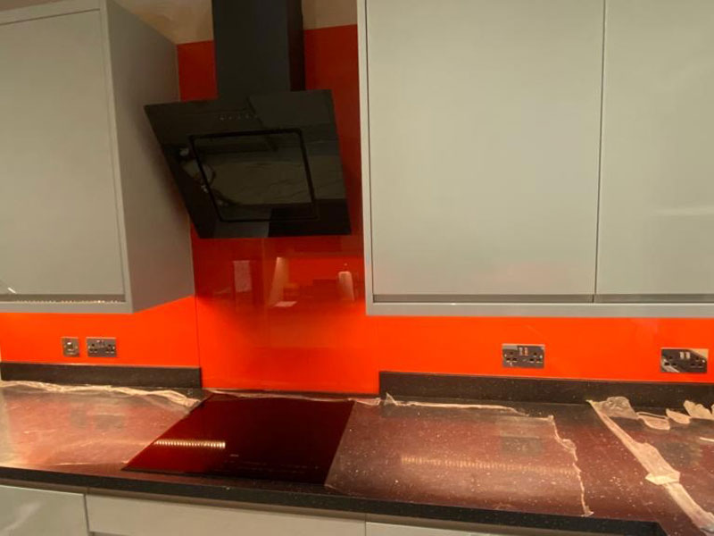
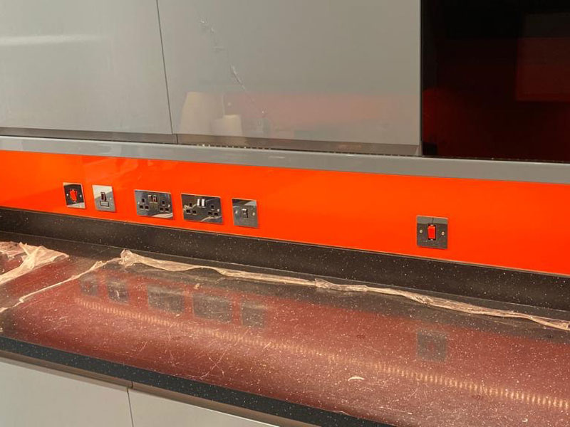
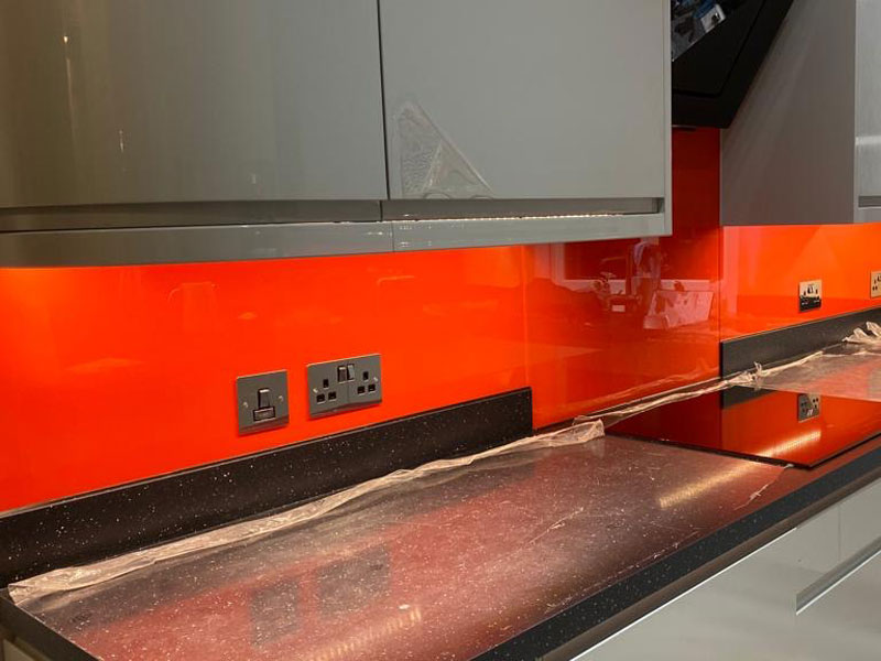
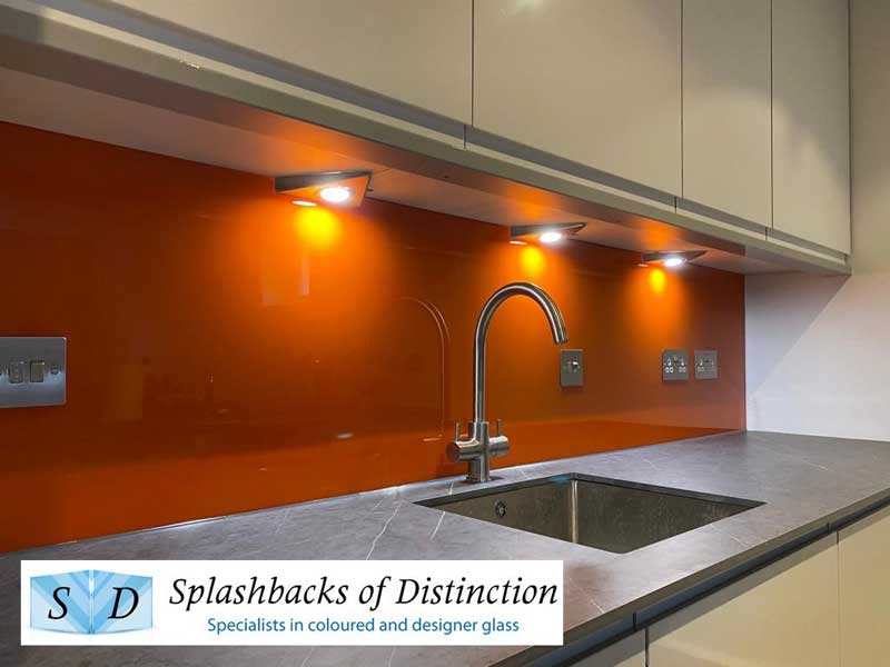
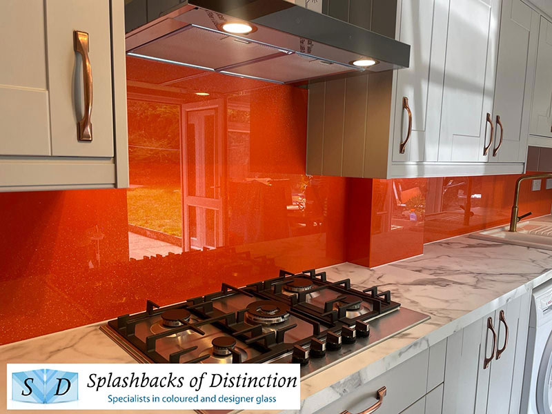
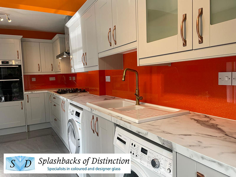
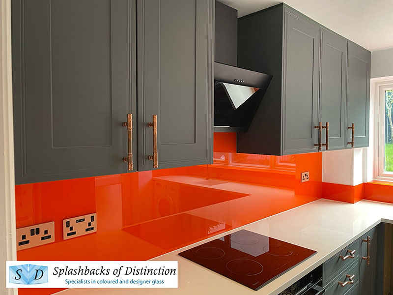
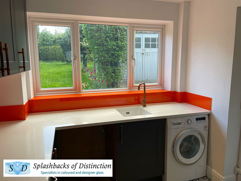


Kitchen splashbacks - orange
Orange is the colour between yellow and red on the spectrum of visible light. Our eyes perceive orange when observing light with a dominant wavelength between roughly 585 and 620 nanometres. In painting and traditional colour theory, it is a secondary colour of pigments, created by mixing yellow and red. It is named after the fruit of the same name.
The orange colour of carrots, pumpkins, sweet potatoes, oranges, and many other fruits and vegetables comes from carotenes, a type of photosynthetic pigment. These pigments convert the light energy that the plants absorb from the sun into chemical energy for the plants growth. Similarly the hues of autumn leaves are from the same pigment after chlorophyll is removed.
In Europe and America, surveys show that orange is the colour most associated with amusement, the unconventional, extroverts, warmth, fire, energy, activity, danger, taste and aroma, the autumn and Allhallowtide seasons, as well as having long been the national colour of the Netherlands and the House of Orange. It also serves as the political colour of Christian democracy political ideology and most Christian democratic political parties. In Asia it is an important symbolic colour of Buddhism and Hinduism.
Orange is chosen for lifeboats and lifesaving jackets because of its high visibility. Yellow is more likely to be chosen for land based high visibility clothing.
In English, the colour orange is named after the appearance of the ripe orange fruit. The word comes from the Old French orange, from the old term for the fruit, pomme d'orange. The French word, in turn, comes from the Italian arancia, based on Arabic, derived from the Sanskrit. The first recorded use of orange as a colour name in English was in 1502, in a description of clothing purchased for Margaret Tudor. Other sources cite the first recorded use as 1512, in a will now filed with the Public Record Office.
Prior to orange being introduced to the English speaking world, saffron already existed in the English language. We referred to the saffron colour, so that orange was also referred to as yellow-red for reddish orange, or yellow-saffron for yellowish orange. Alternatively, orange things were sometimes described as red such as red deer, red hair, the Red Planet and robin redbreast.
In ancient Egypt, artists used an orange mineral pigment called realgar for tomb paintings, as well as other uses. It was also used later by Medieval artists for the colouring of manuscripts. Pigments were also made in ancient times from a mineral known as orpiment. Orpiment was an important item of trade in the Roman Empire and was used as a medicine in China although it contains arsenic and is highly toxic. It was also used as a fly poison and to poison arrows. Because of its yellow-orange colour, it was also a favourite with alchemists searching for a way to make gold, both in China and in the West.
Before the late 15th century, the colour orange existed in Europe, but without the name; it was simply called yellow-red. Portuguese merchants brought the first orange trees to Europe from Asia in the late 15th and early 16th century, along with the Sanskrit naranga, which gradually became part of several European languages.
Although the colour orange has a rich and colourful history, it is the perfect colour to brighten up the home when covering a wall. It gives a lovely warm glow that gives off a summery feeling. What better colour to have for a glass kitchen splashback?
Toughened glass products for any room
Remember that at Splashbacks of Distinction we manufacture, supply and fit splashbacks for any room in your home or office, not just the kitchen. We supply the following items in premium quality glass to enhance your property:
- Printed Glass Kitchen Splashbacks
- Printed Glass Splashbacks with a High Definition Picture
- Glass Kitchen Worktops
- Glass Balustrades
- Toughened Glass Shelves
- Bespoke Glass Mirrors
- Bespoke Shower Screens and Enclosures
- Juliet Balconies
Why not call us today for a free, no obligation quote on a new glass splashback or one of our other specialist toughened glass products?
Gallery list
Kitchen splashbacks - images of food
Kitchen splashbacks - city scapes
Kitchen splashbacks - brick and stone
Kitchen splashbacks - abstract patterns
Kitchen splashbacks - abstract waves
Kitchen splashbacks - colour fades
Kitchen splashbacks - SofD own range
Kitchen splashbacks - light blue
Kitchen splashbacks - dark blue
Kitchen splashbacks - turquoise
Kitchen splashbacks - light green
Kitchen splashbacks - dark green
Kitchen splashbacks - lime green
Kitchen splashbacks - light grey
Kitchen splashbacks - dark grey
Kitchen splashbacks - varied colour schemes
Kitchen splashbacks - mirrored finish
Kitchen splashbacks - antique mirrored finish
Kitchen splashbacks - bronze mirrored finish
Kitchen splashbacks - copper mirrored finish
Kitchen splashbacks - metallic finish
Kitchen splashbacks - silver sparkle finish
Kitchen splashbacks - crystal sparkle finish
Kitchen splashbacks - glitter finish
Internal balustrades with glass infills
External balustrades with glass infills
Commercial balustrades with glass infills

Showroom: Unit 11, Broomhall Farm, Watton At Stone, Hertford SG14 2RN
Splashbacks of Distinction is the trading name of RDC Glass Ltd


